improving drawing and designing skills
For a long time I’ve wanted to improve my drawing skills so that I can create my own embroidery designs. Last year, one of our guild members held a class on blind contour drawings, specifically portraits. I was immediately drawn to this project as blind contour drawing is a great exercise for beginner artists.
These drawings are simple and whimsical and after I had drawn a few portraits, I realized that they would be very easy to translate into embroidered pieces. All were stitched with one strand of DMC cotton in black (310) in backstitch.
Keeping the design simple allowed me to explore different styles of fabric dying. Wax crayon tinting was used in the self portraits to create a focal point (hair and hats). In all of the pieces watercolour paints with salt resist were used to dye the fabric after the portraits were embroidered.
With all of the pieces, I applied melted plain wax (tea lights from Ikea) with a small brush near the embroidered stitches to make sure that some areas of the fabric did not hold the dye. The wax was applied to the back and later, when the fabric paint was dry, the excess wax was ironed out of the fabric.
Original Drawings
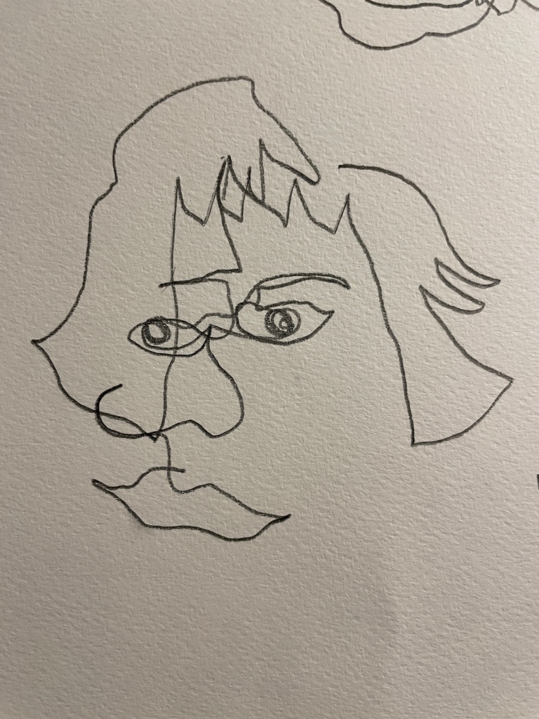
I used a very soft pencil for these drawings. The thick lines are great! How easy would they be to create an embroidery?

Practicing with Watercolours, wax and salt

Vincent A
I had a lot of fun with both of these pieces! Vincent A and Vincent B are actually blind contour drawings I did of my husband. They don’t look much like him, but I did find that they looked mildly reminiscent of Vincent Van Gogh! So I ran with that theme and am very pleased with how both Vincent A and B turned out in the end!


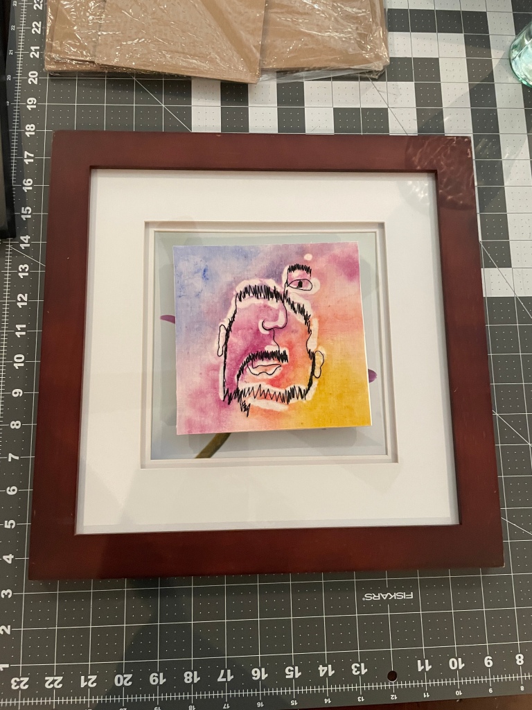


A white mat and simple brown frame set off the portrait perfect. The glass was removed from the frame to give it an “art gallery” style feel.
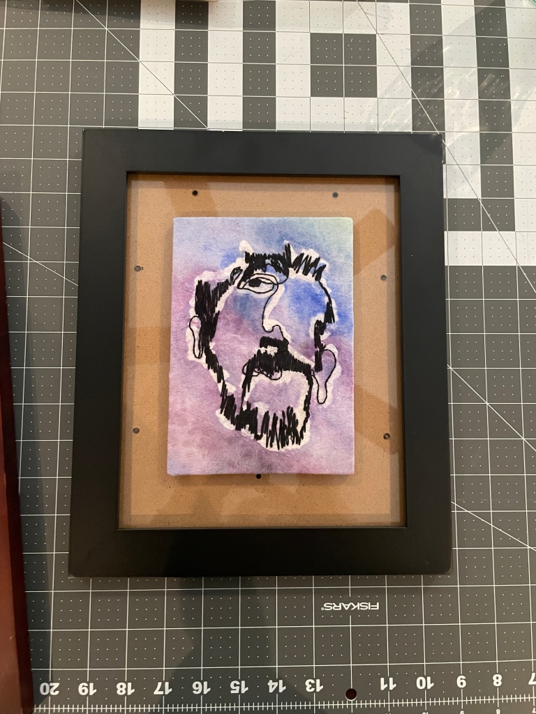
Vincent B
It seems that I have trouble adding a second eye in these portraits. I am quite happy with the one-eyed portraits!


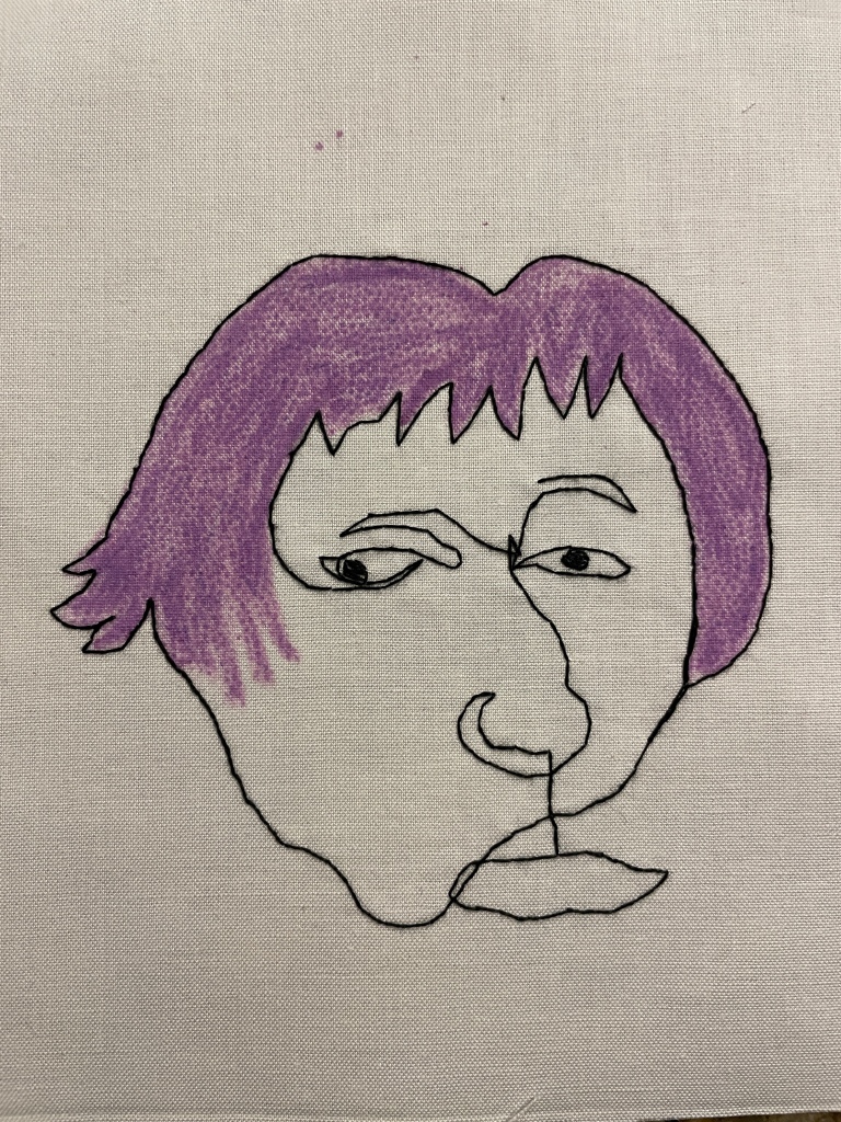
Self Portraits: Channeling Andy Warhol
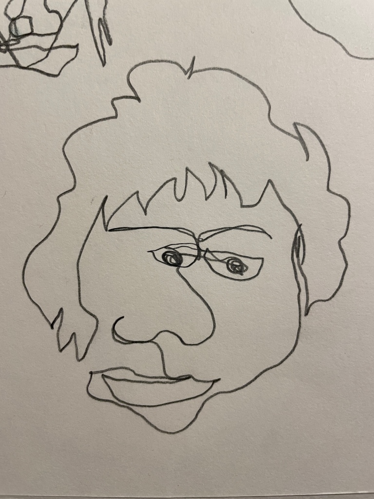
These are me – as seen from a mirror. I found it uncomfortable drawing the lines of my face – it seemed strange looking closely at my features. These drawings are much simpler than the Da Vinci pieces. Below are the original pencil drawings.


crayon tinting
These self portraits immediately made me think of Any Warhol. The black simple lines just begged for bright colours! Wax crayons were just the thing. Years ago, I had dabbled with crayon tinting on fabric (a very popular technique used by Crabapple Hill). As soon as I added the crayon tint, I knew that it was just the right thing to do.
An interesting and unintended design element was the dotty texture in the tinting – I always add a layer of interfacing to my embroidery pieces (for stability and to ensure that carried threads, if there are any, are not noticeable from the front). The adhesive on the interfacing is applied in small dots, which melt when ironed onto another fabric. Either I didn’t heat the interfacing enough to melt all of the adhesive, or there’s always just a little that remains behind. Either way, I really liked the textured look I ended up with


OOPS…
There’s always an “oops” or two when experimenting with new painting techniques. These were my two. The red is just wrong (and you can see why). The blue paint in the other piece bled into the flesh tone (which was also not good).
How to fix this? Well, I had to re-stitch the portraits and re-tint the hair. To prevent the bleed through, I painted on a layer of clear melted wax around the outline of the head (I also did this on the Da Vinci pieces).
You can see this outline on the red piece – but it still bled through. For future pieces I painted a heavy line of clear wax on the back side of the piece (I think the interfacing was causing the paint to bleed through.
You can see the wax outline quite clearly in the 4 final pieces (more so with the orange and green). It gives a “halo” around the outline which is a cool effect! Another totally unintended element – but another that I really quite like!


Painting the backgrounds – the ones that worked
After working through some technical issues with poorly chosen colours and paint going where I didn’t want it, I finally found colours that worked! A little more subtle, but bright and bold and in keeping with my Andy Warhol inspired look.


Putting it all together – a tutorial
These pieces needed to be together, but not framed. I had some interesting black and white striped canvas in my stash which offered a clean and modern feel. The piece needed to be free-standing so I opted to do a 4 segmented upright, self folding design.
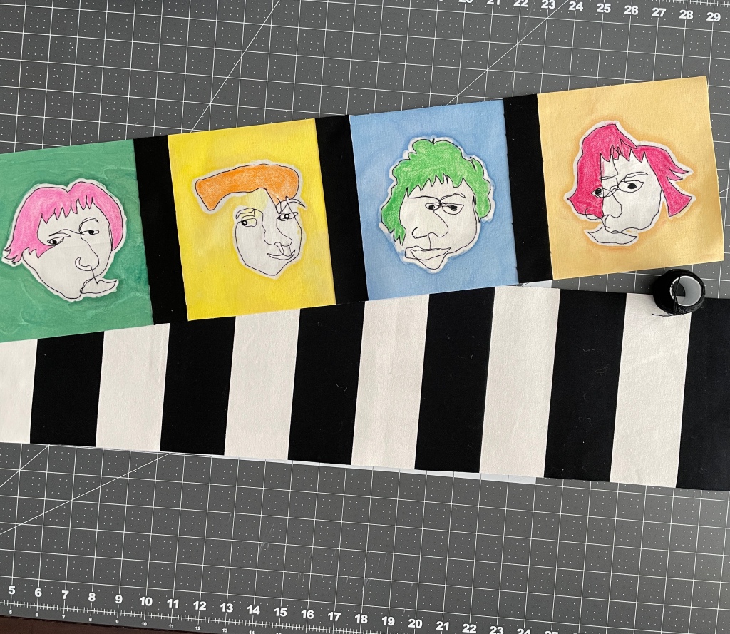
I added a strip of black between the portraits to add some framing. I then cut the back piece to size.
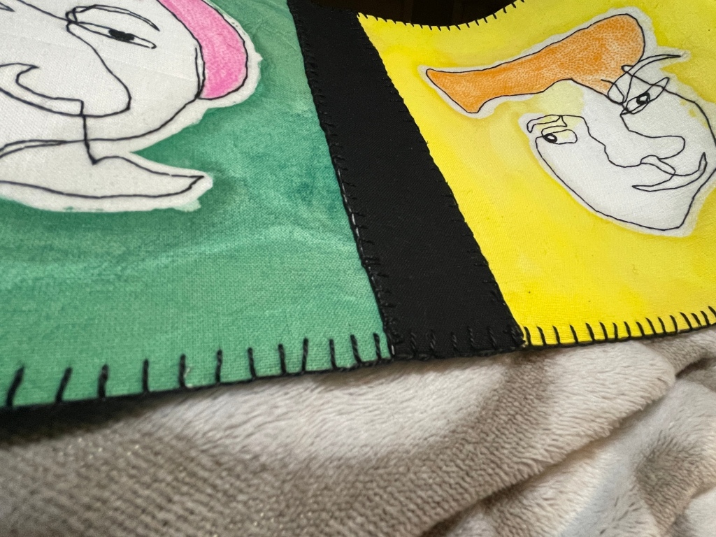
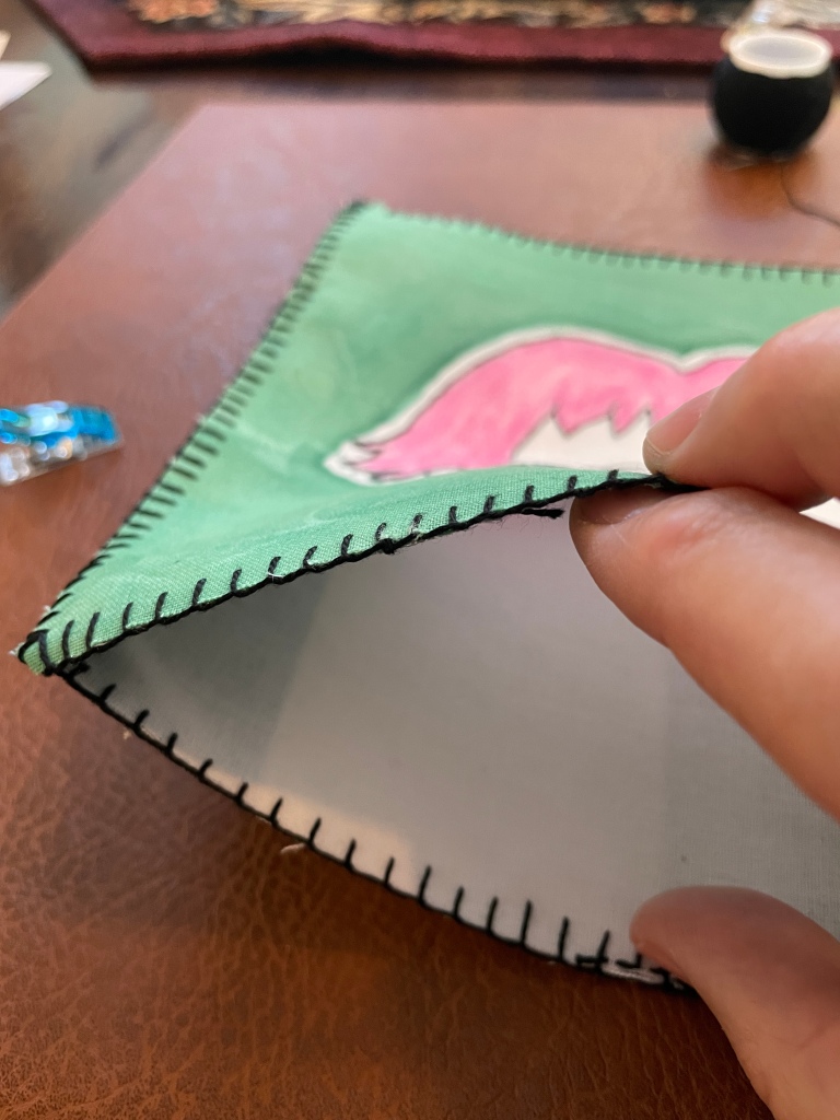
Both the front and back pieces were edged using buttonhole stitch.
A nice close up of the button stitch. I’ve used a DMC Perle #8 in black (310).

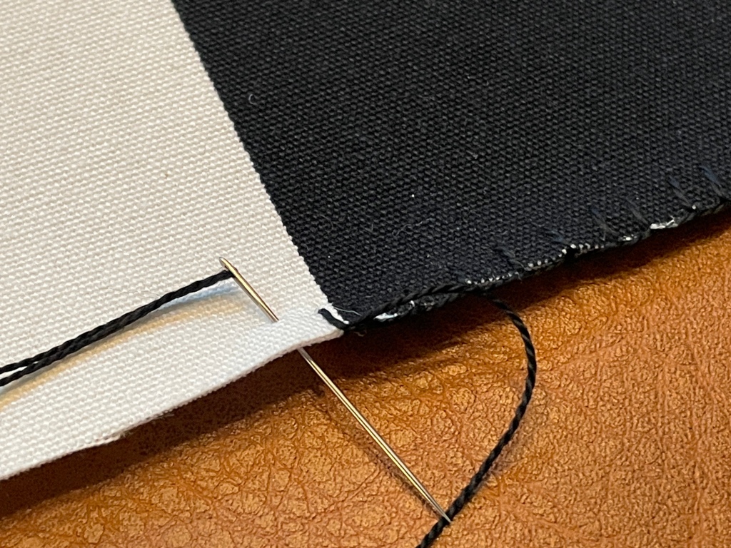
The front and back were held in place with clips and then whip stitched together on the sides and top. The bottom was left open for the time being.

A nice close up of the whip stitch. Catch the buttonhole loops on both the front and the back pieces. They hold together very well!
The bottom has been left open!
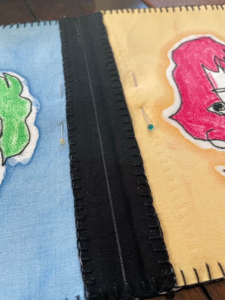
To create the 4 segments, I drew lines down the middle of the black strips separating each portrait.

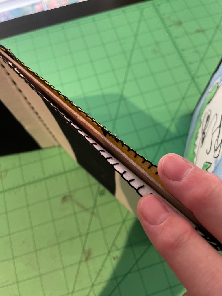
I then used a running stitch to sew the front and back together.

This created 4 “pocket” segments!

I then cut 4 pieces of heavy cardboard to size and slipped them into each “pocket”.

I impressed myself by making each “pocket” almost exactly the same size. I had to trim the cardboard a bit to get it to fit just perfectly inside the pockets. You don’t want the cardboard to fit inside too tightly as it will pull the buttonhole stitch and the fabric won’t lay flat.
Once the cardboard is nicely situated inside each “pocket”, I whip stitched the bottom closed using black DMC Perle #8. To keep the corners from fraying (and to add a little more stability), I dabbed a little FrayCheck on the corners.

The piece stands perfectly on its own now with the segments bending very easily! This piece is ready for exhibition!

